

About the (Re)brand
The Candy Curio is YVR’s only mobile candy shop featuring fun and nostalgic sweets for all ages. It is a family-run store that was opened with a vision to give back to the community and allow disabled youth to have an opportunity to gain work experience and hands-on skills such as reading, picking, packing and overseeing the quality control of orders (as well as practice customer service and stocking skills). Their mission is all about creating a “sweet” experience where you get to “Treat Yourself” and your loved ones!
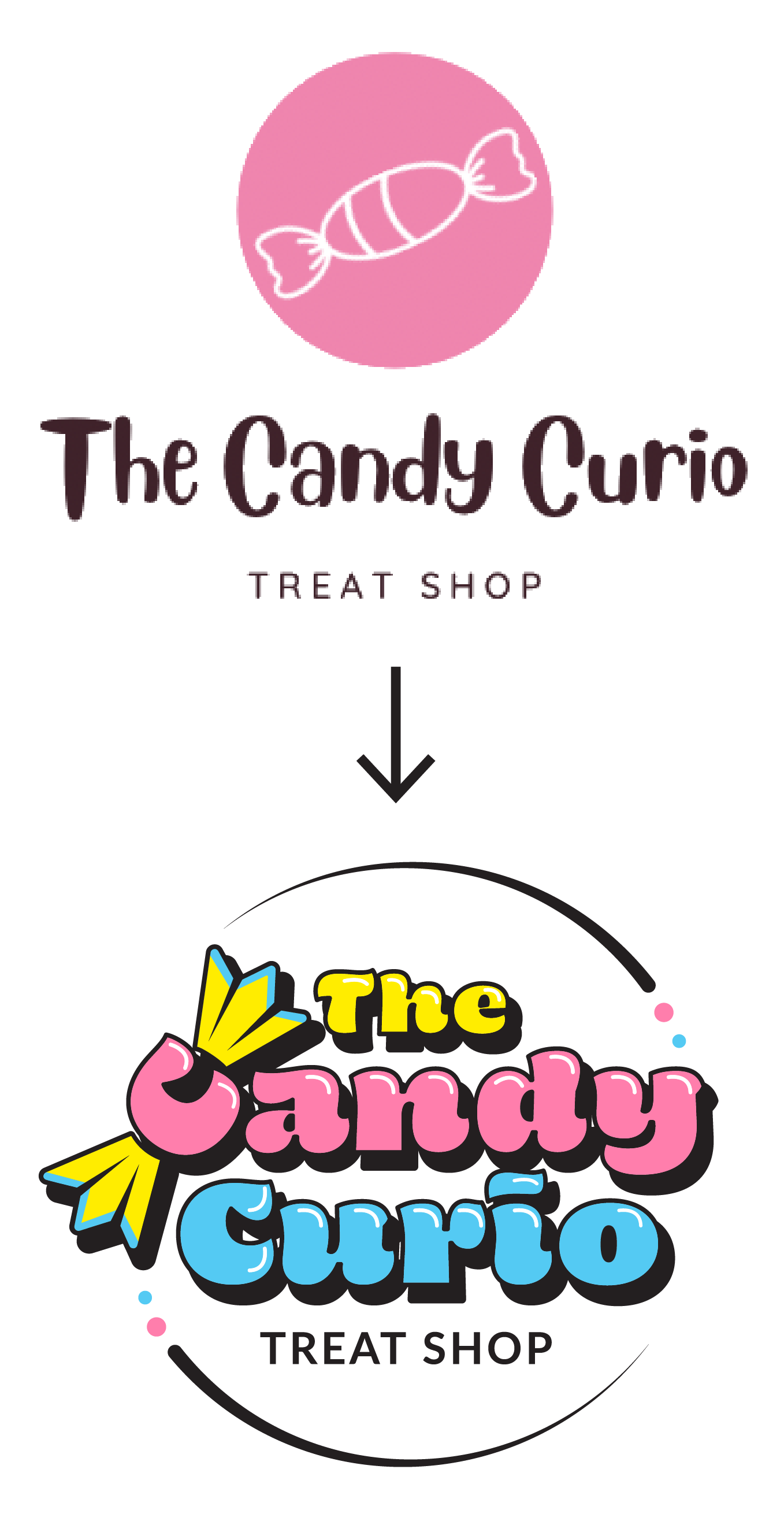
When we first started working together, The Candy Curio had a logo design that was made from a generic Canva graphic that didn’t fully capture the passion and energy behind their brand (AND that they saw in someone else’s branding 😨). After working together with me, The Candy Curio walked away with not just a new logo that was completely unique, but a fully revamped brand identity that looks “retro” without being “dated”, and “fun” without being “childish”!
The Inspo

The Candy Curio’s aesthetic was inspired by everyone’s favourite childhood candy stores — but with a retro twist. The goal was to recreate the bright, bubbly feeling you get when you walk into a candy store, but with an old-timey vibe that makes parents feel right at home along with their kids.

The Reveal! 👇


Your brand could look this awesome!
If you’ve been drooling over these portfolio pieces and want a facelift for YOUR brand, hit the button below to book a call with me and see if we’re the right fit!